DIGITAL MARKETING
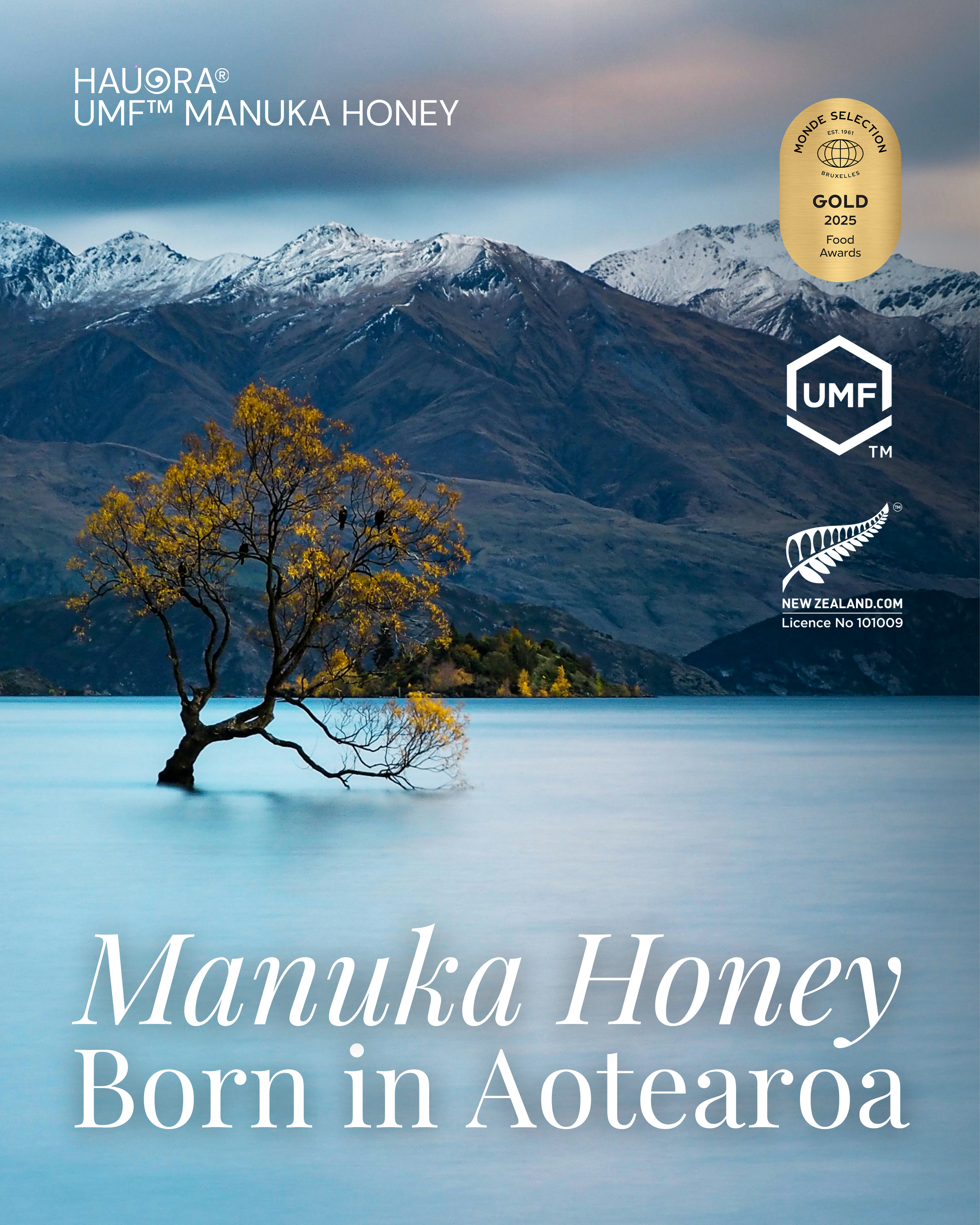
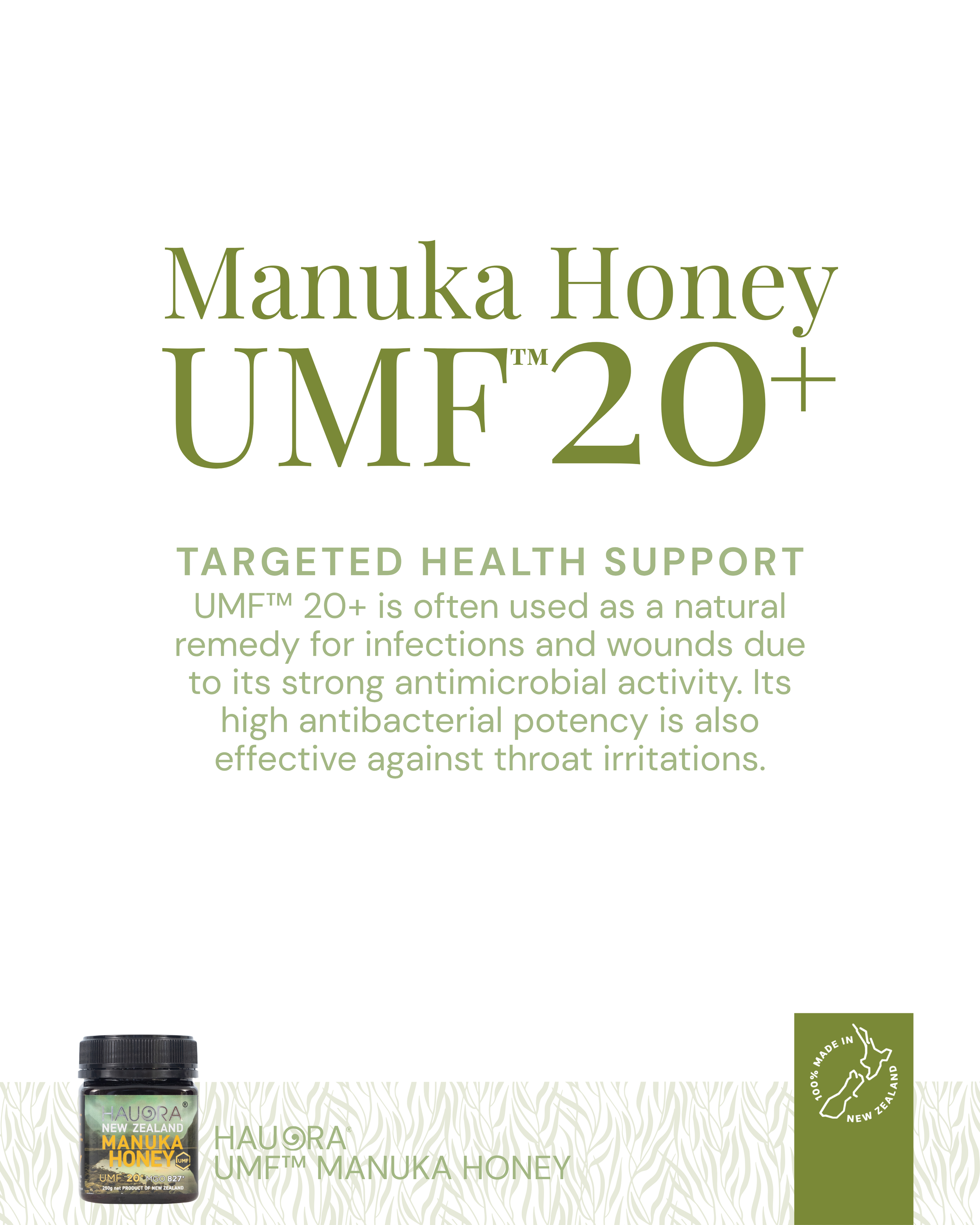
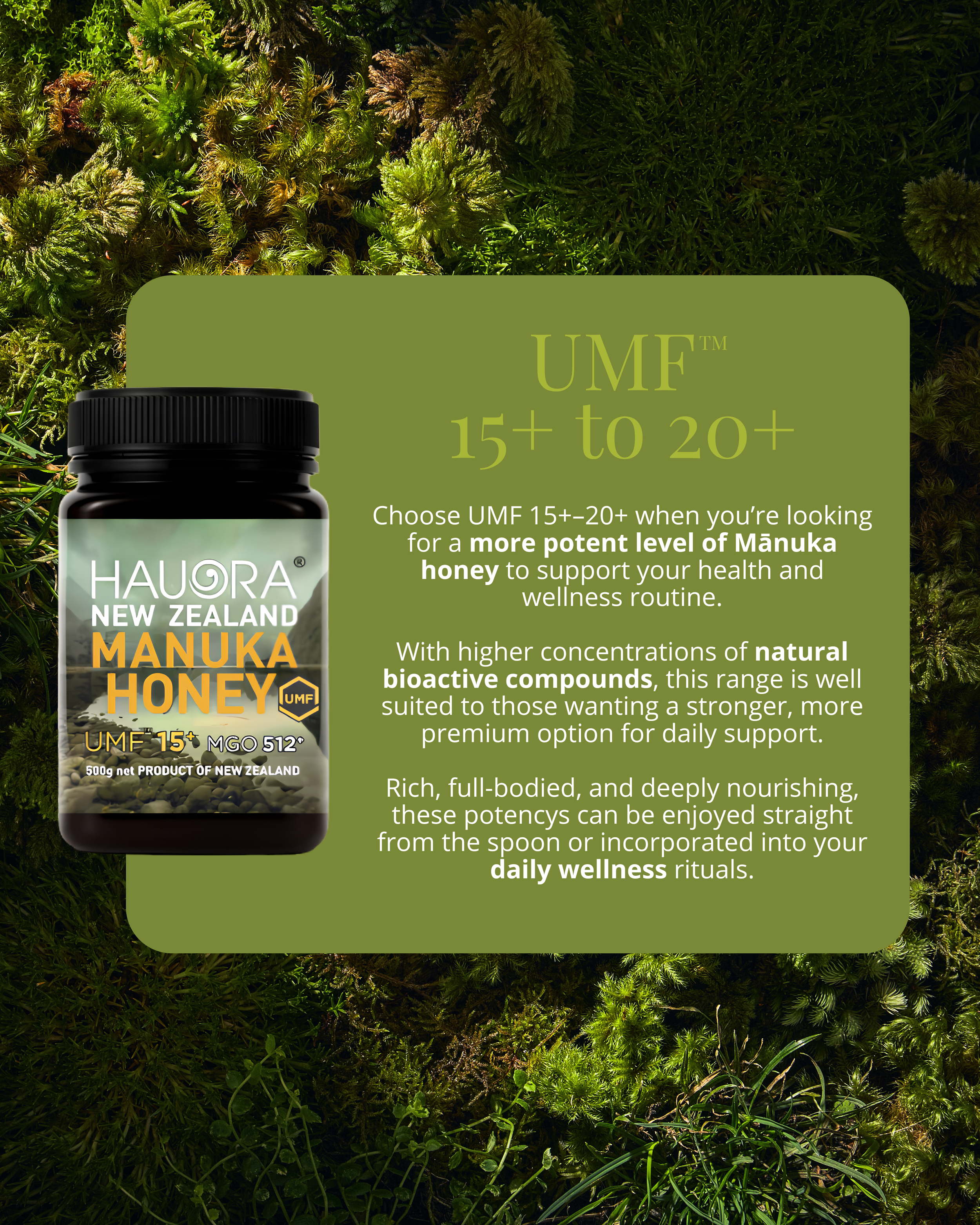
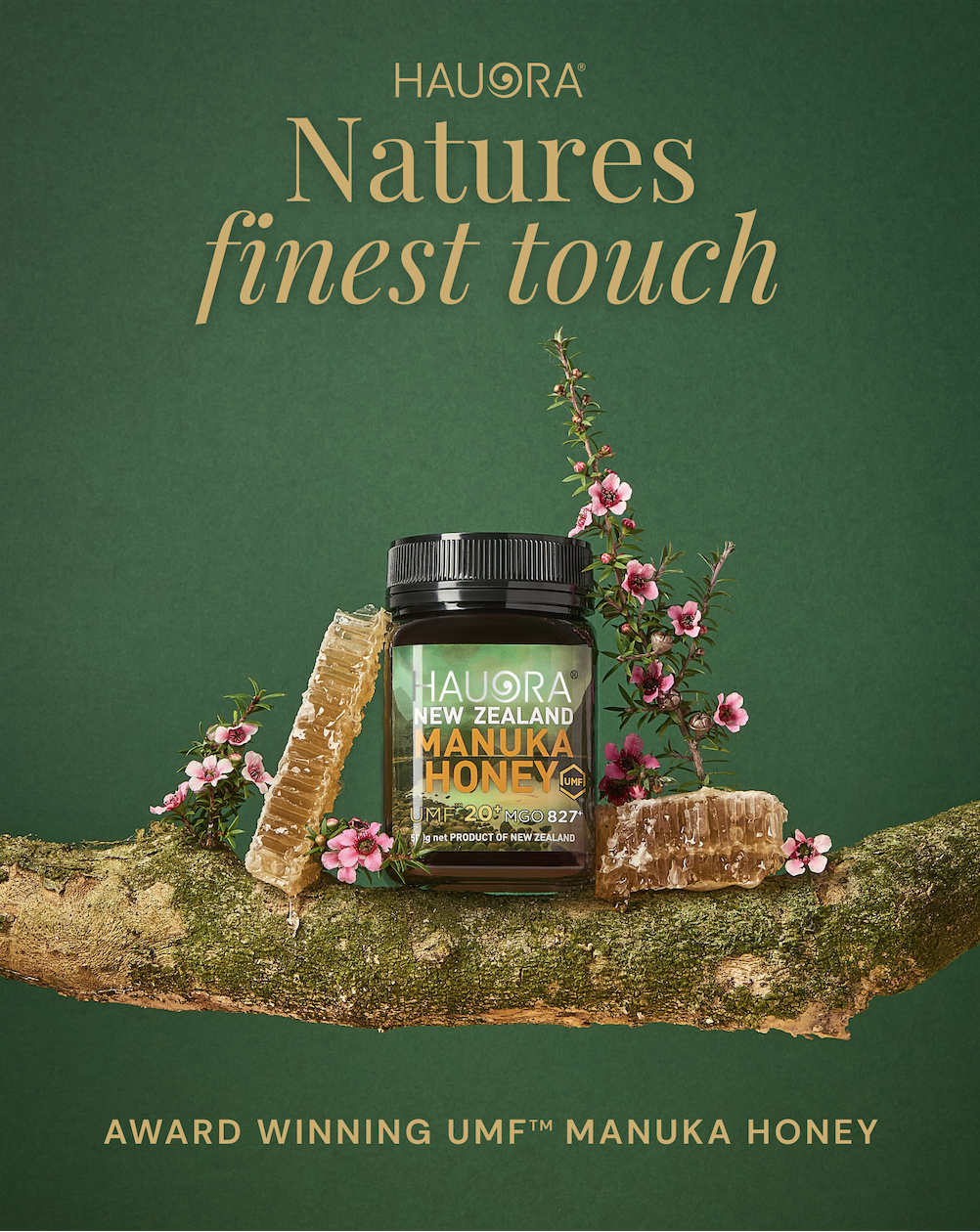
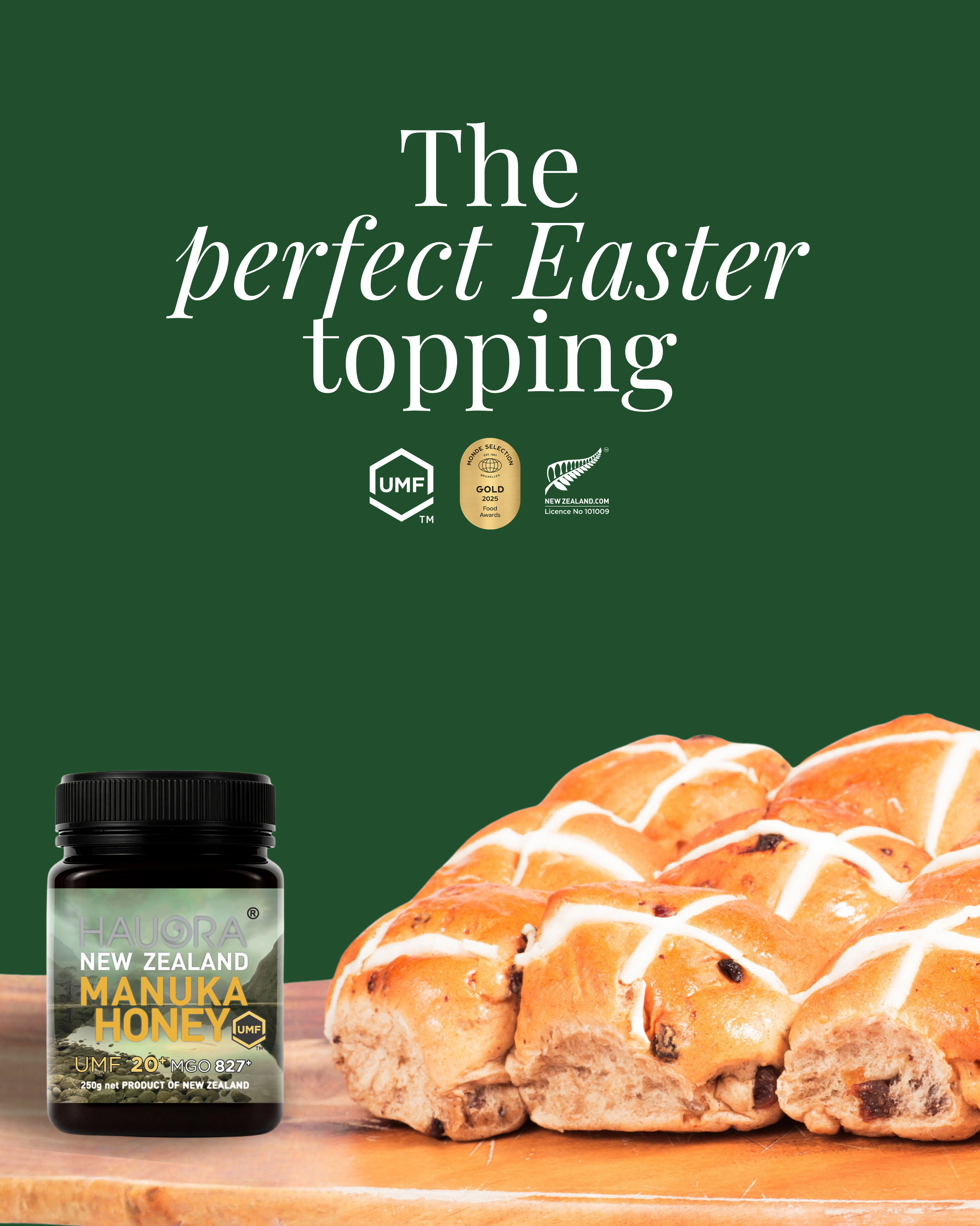
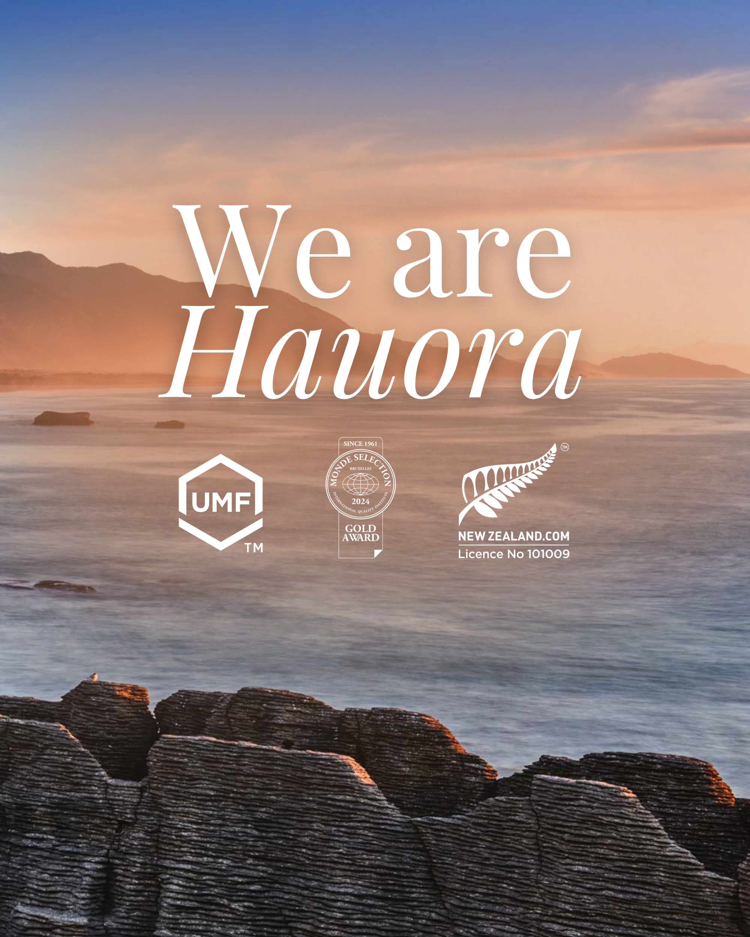
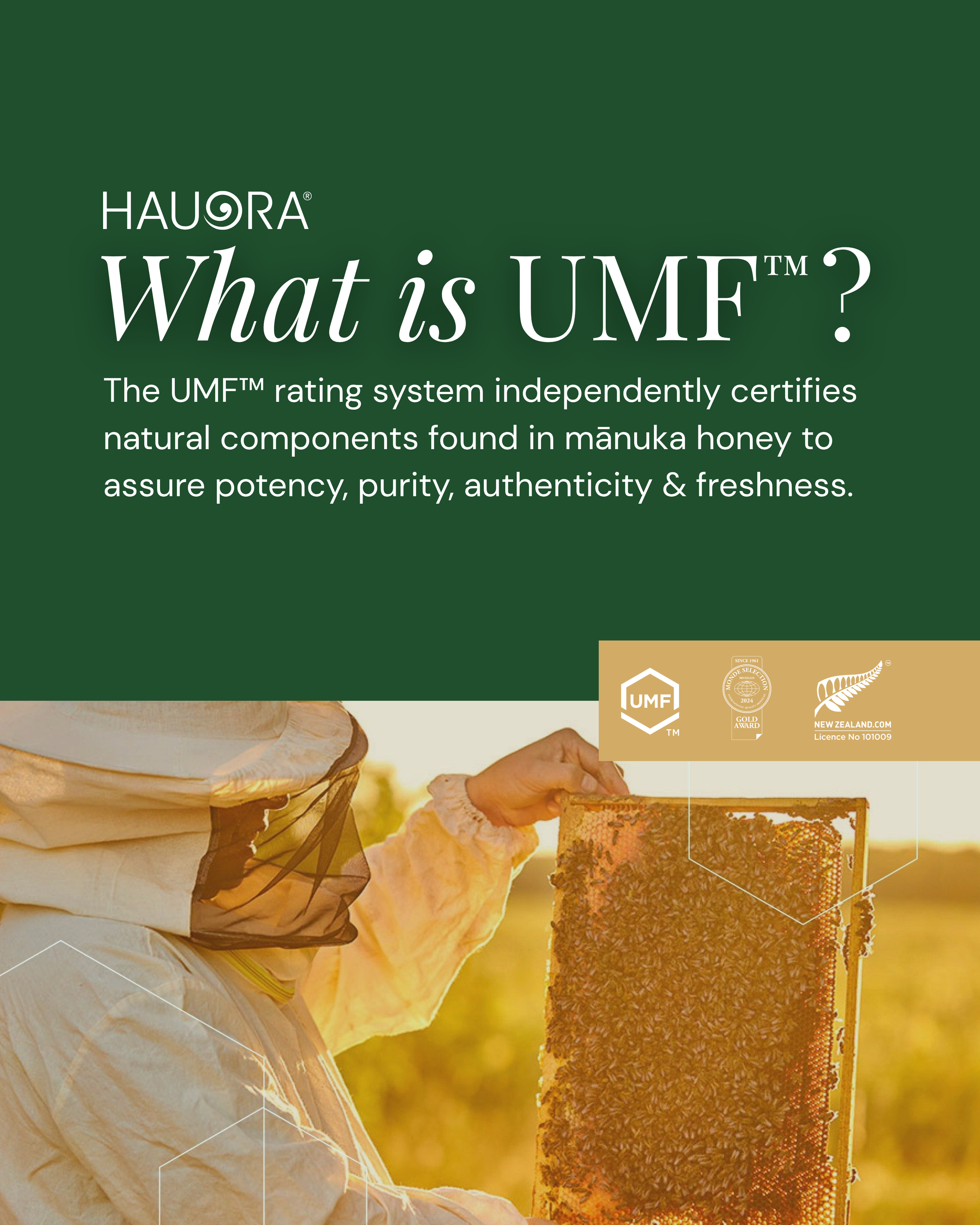
A New Zealand wellness brand specialising in premium Mānuka honey products, they approached with the goal of rebuilding their social media presence from the ground up - establishing a premium, credible identity and a strategy for sustainable, organic growth.
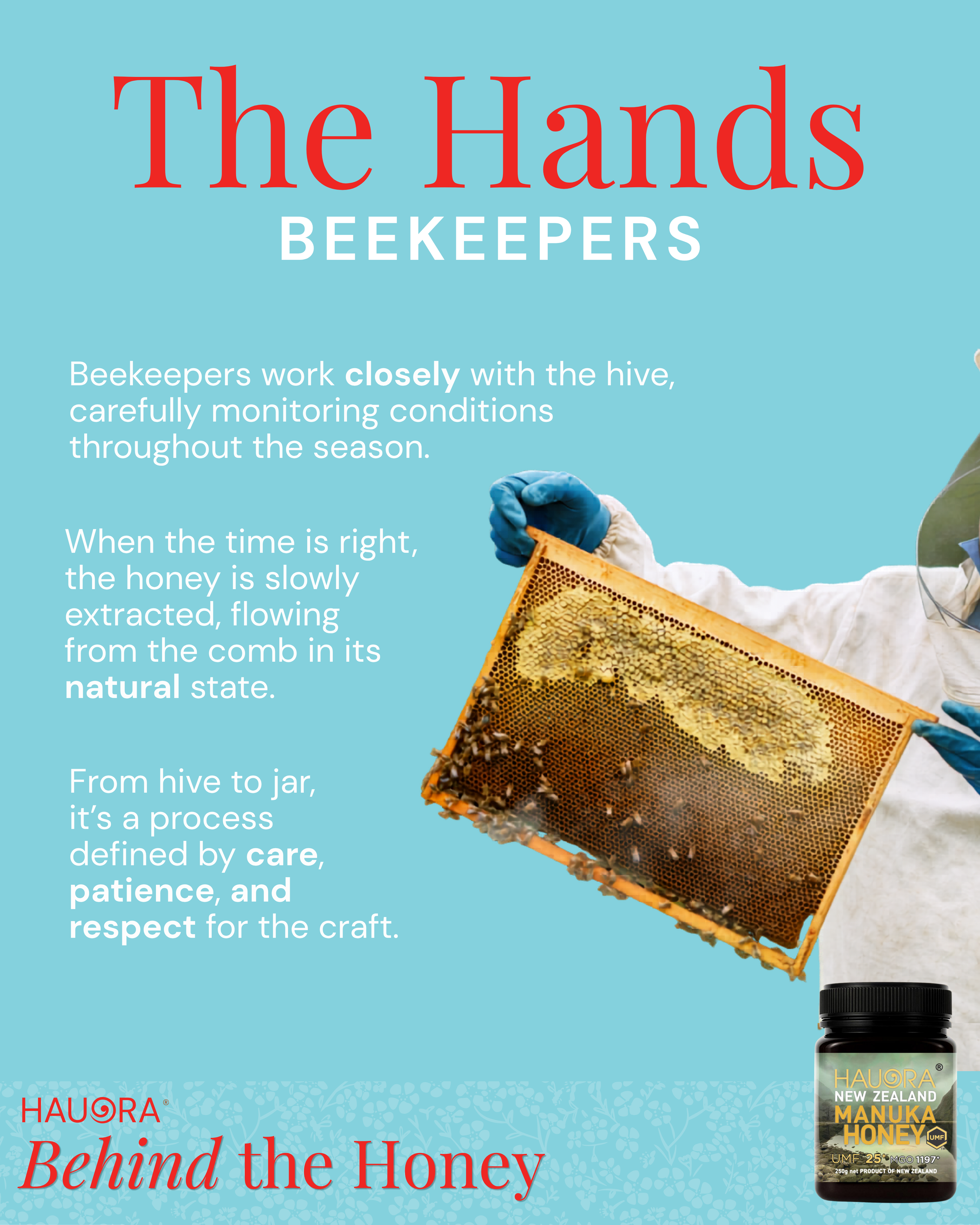
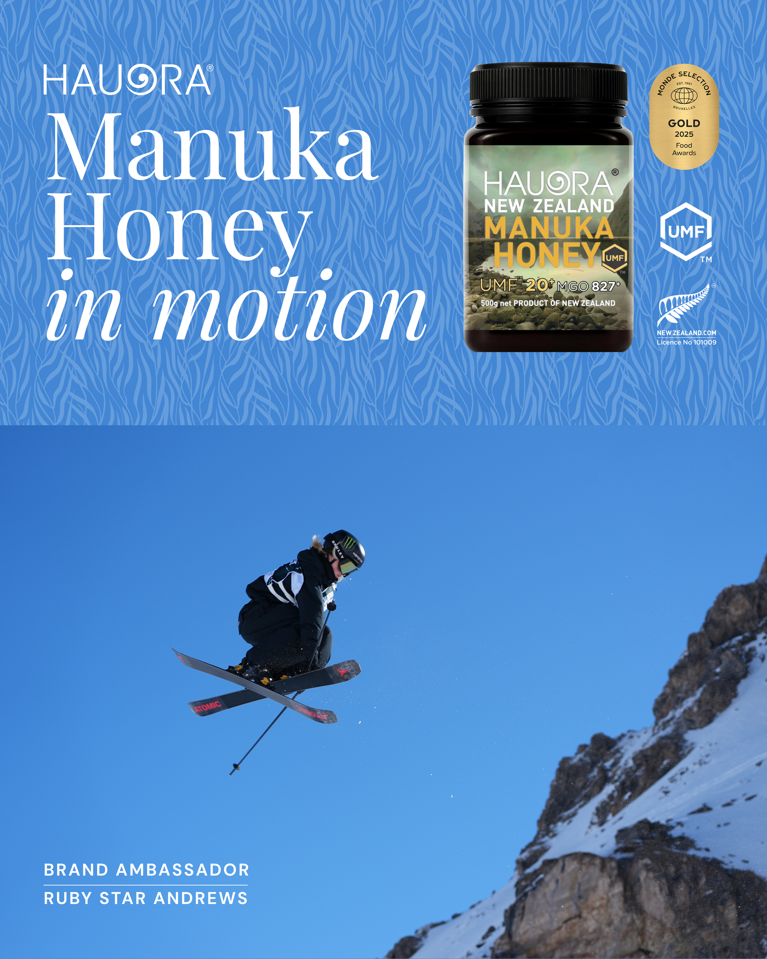
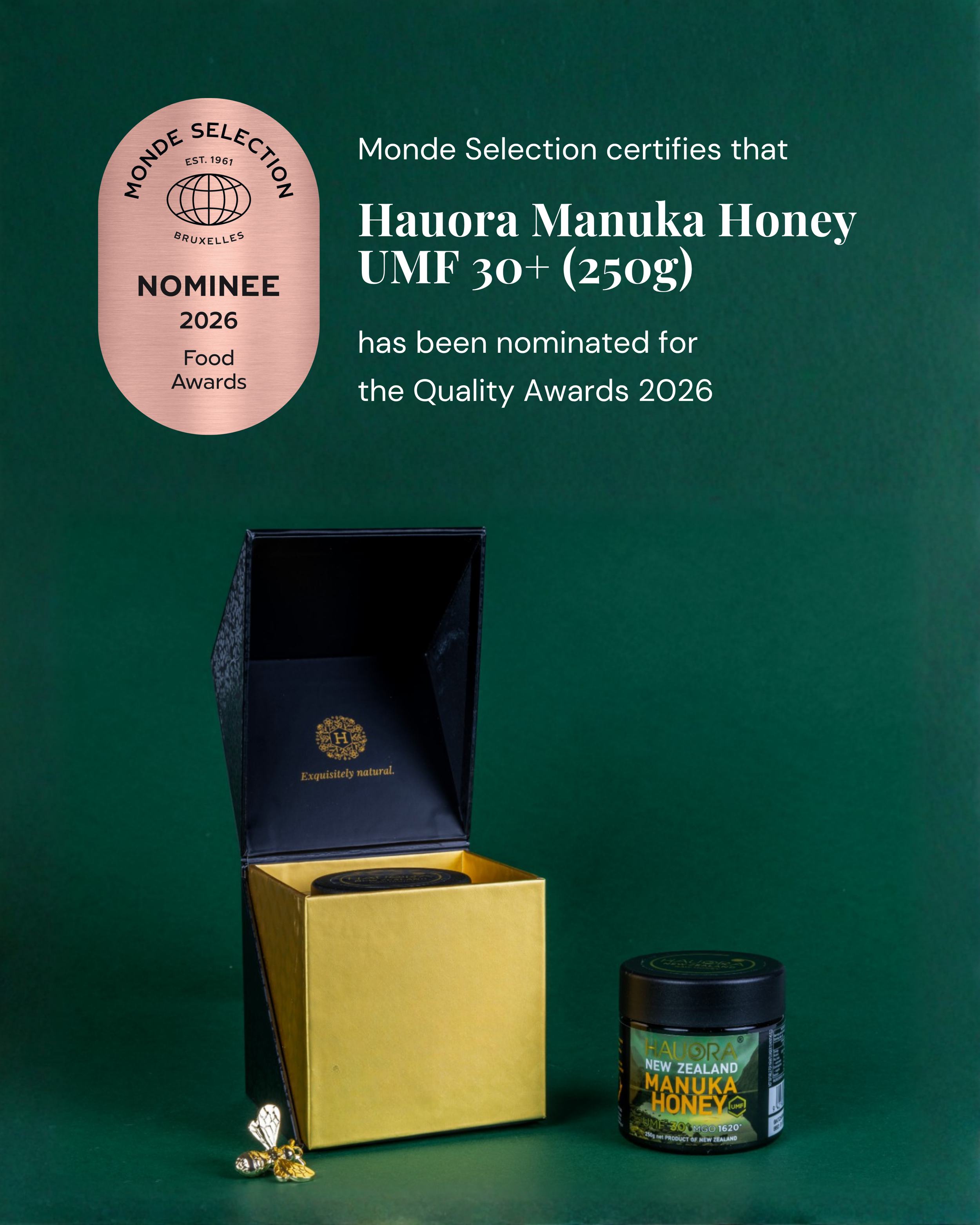
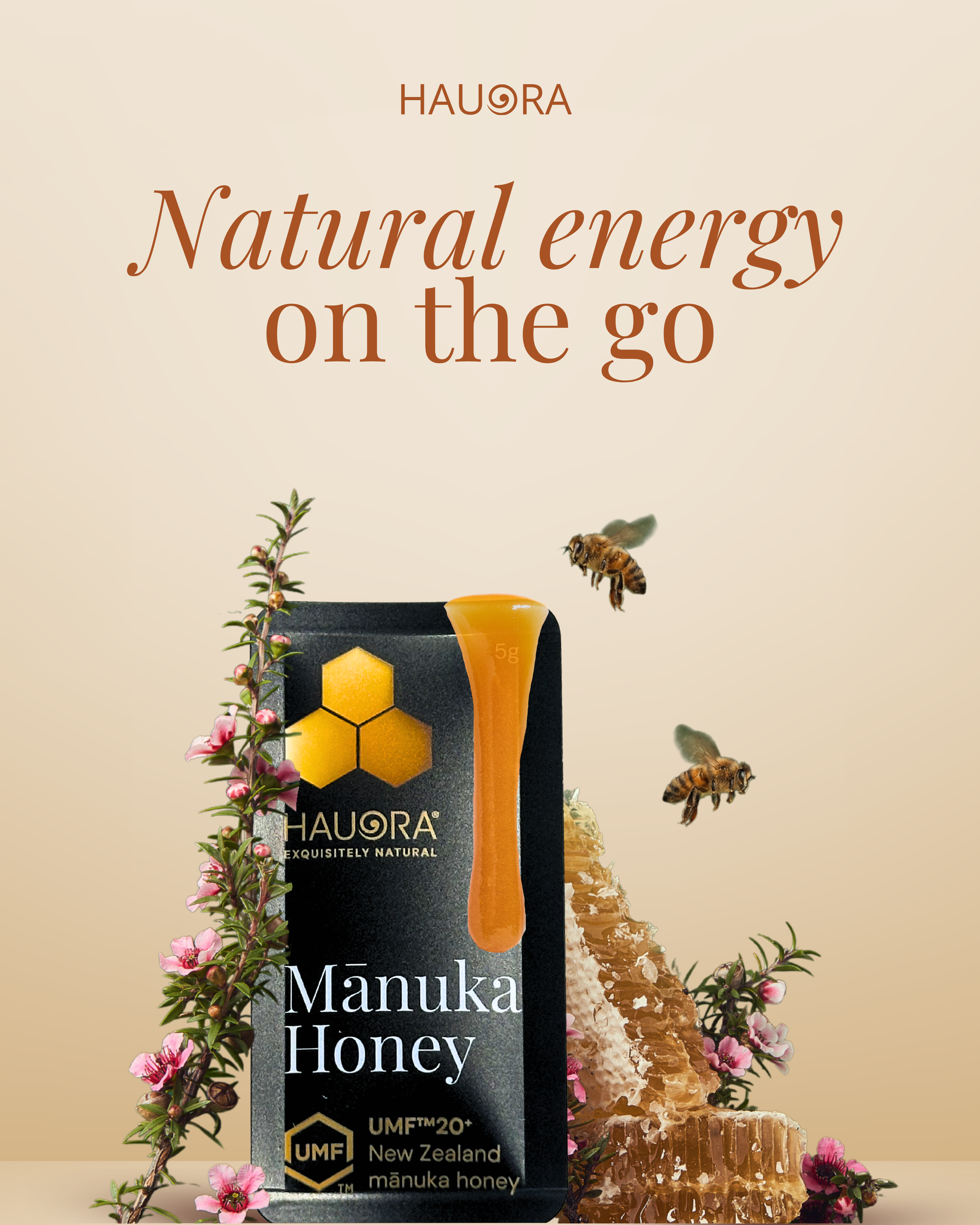
Co-leading this project, I worked across both strategy and execution, helping shape the brand’s digital direction and content approach.
A key challenge was communicating the natural benefits of Mānuka honey without making unsupported claims, requiring a careful balance between education, credibility, and visual storytelling. At the same time, it was important to reinforce Hauora’s long-standing market presence. While their social media was new, the brand itself held decades of award-winning experience within the honey industry, something we were intentional about reflecting throughout the content.
In the first month, the Instagram account grew from 0 to 150 followers and reached more than 8,000 people, establishing a strong foundation and cohesive presence that saw measurable and continued growth in the months that followed.

Hauora Honey
Originally part of the hospitality team, my role grew to include developing Boomrock’s social media presence organically and elevating the way the brand showed up online. As the sole person managing social, I led the full content process, from ideation and creation through to scheduling and performance tracking.
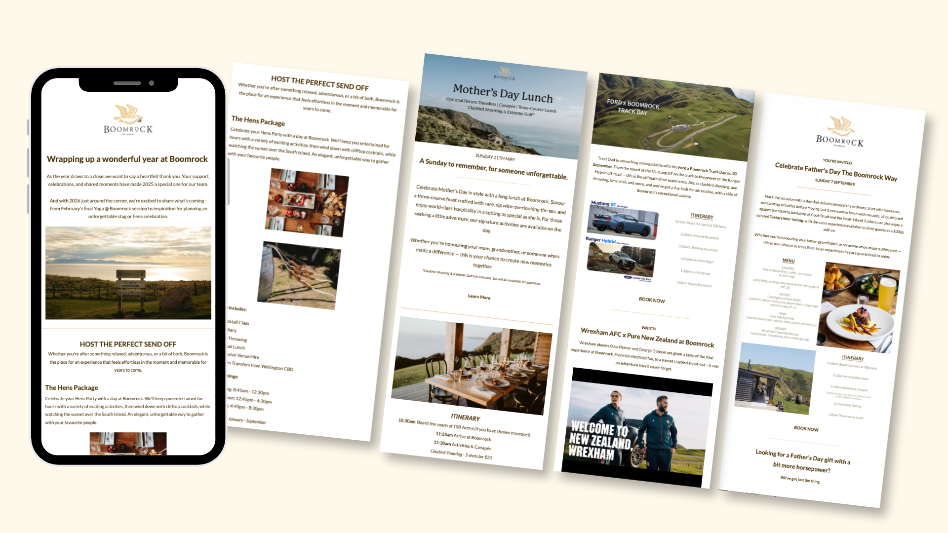
Boomrock’s ticketed dining events and open days required a more strategic push, combining social media with email marketing to drive awareness, engagement, and bookings across both new and existing audiences.
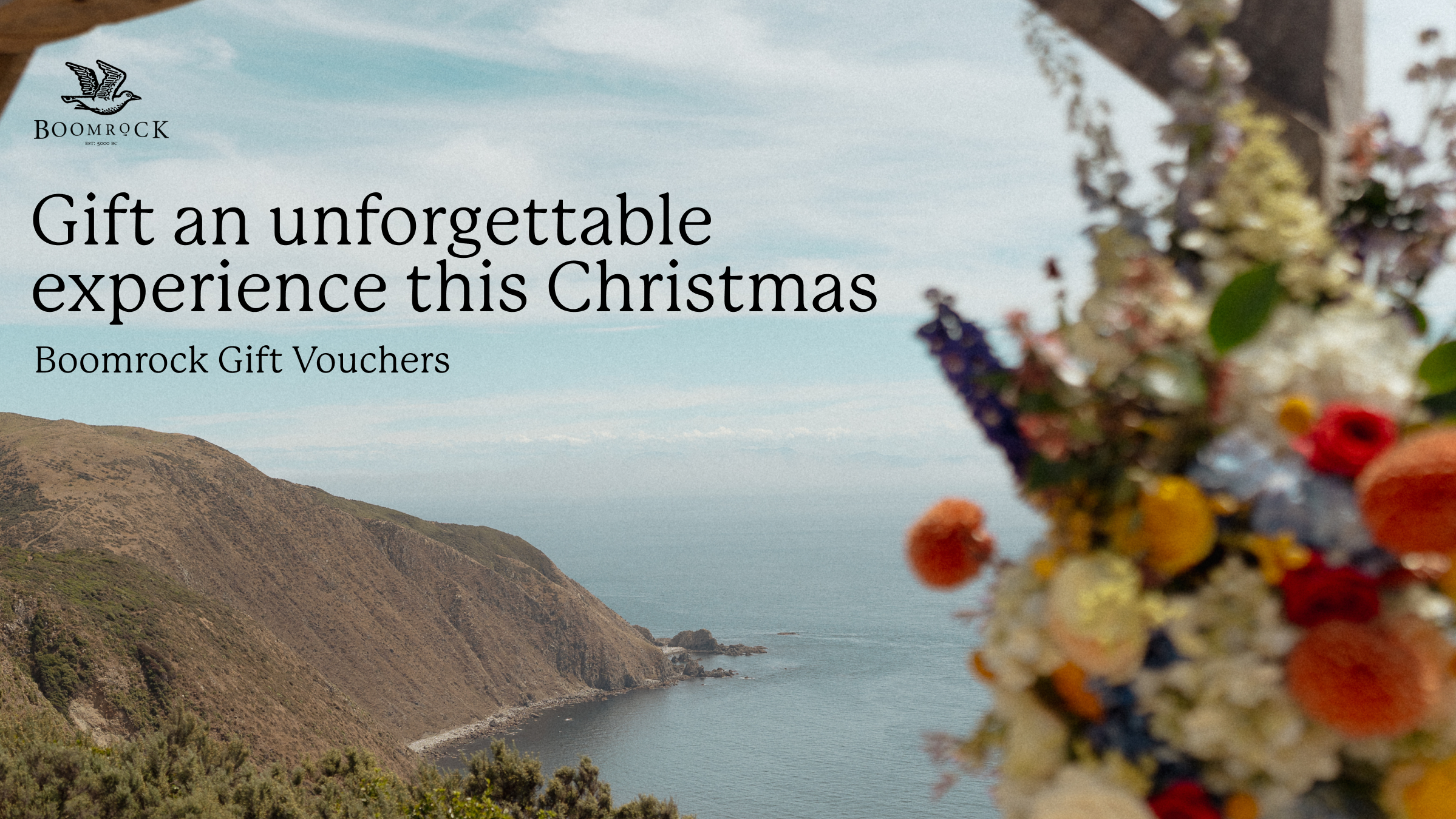
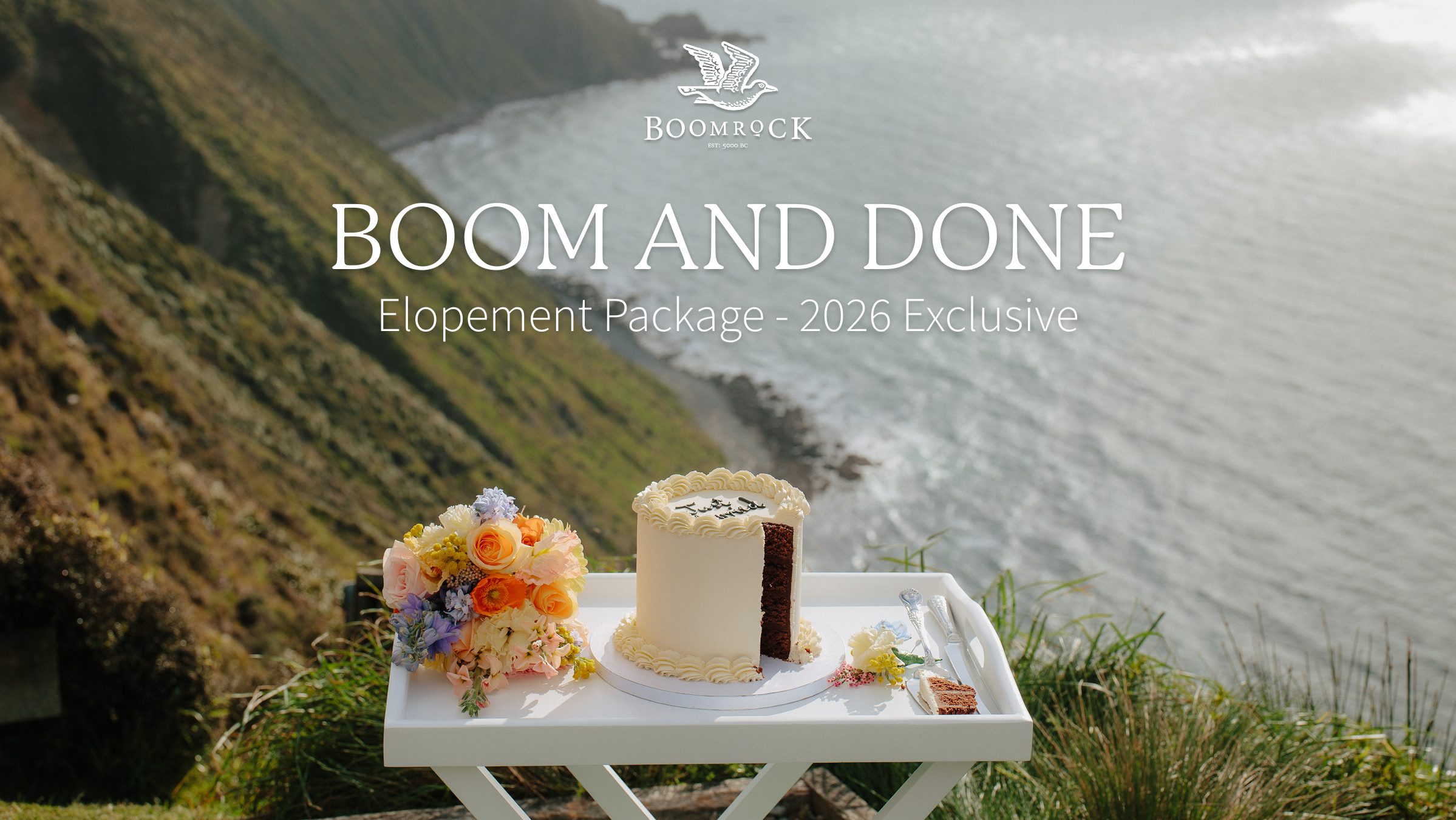
I determined that the most impactful content was that which allowed people to experience Boomrock before they even arrived - providing a virtual taste for the level of quality, exclusivity, uniqueness and adventure Boomrock has to offer.
Arriving at this conclusion came from a thorough understanding of the audience, a refined tone of voice, and consistently testing what content resonated. Whether showcasing the landscape, the energy of events, or the authentic behind-the-scenes moments that make Boomrock what it is.
Boomrock Lodge
A premium events and hospitality venue set across 1,600 acres of coastal farmland just outside Wellington. From luxury overnight stays to clay bird shooting and axe throwing, Boomrock is designed for people looking for something a little less expected.
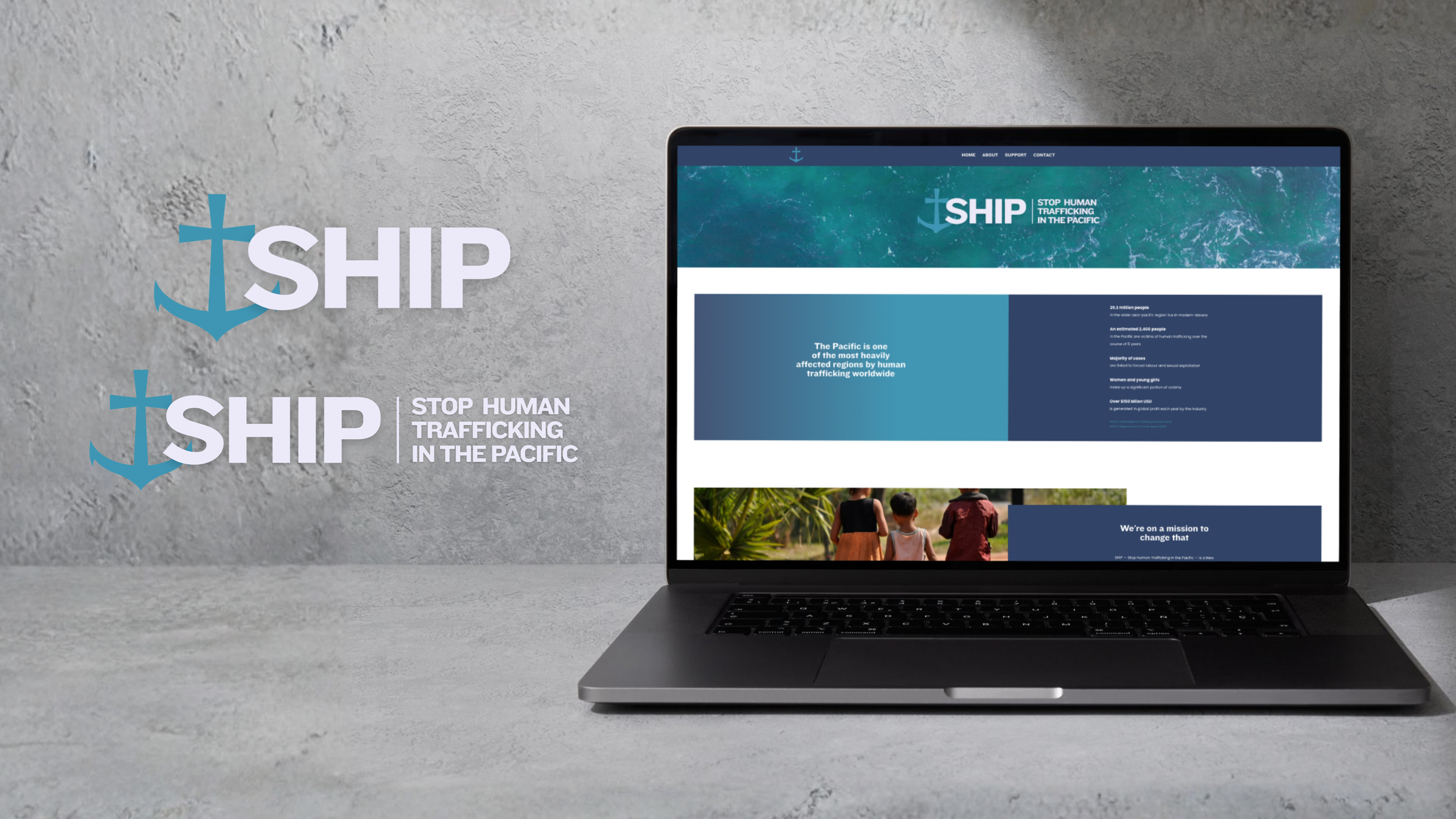
As the only organisation solely focused on combating human trafficking in the Pacific, SHIP’s identity needed to reflect both its regional focus and faith-led mission.
The logo combines an anchor with a Christian cross, symbolising stability, faith, determination and SHIP’s deep connection to the Pacific. An ocean-inspired colour palette and imagery further reinforced this identity.
Accessibility was also a key consideration throughout the design process, with clear typography and a user-friendly visual system chosen to ensure content remained approachable for a wide audience.
Website Design
As a newly established charity, SHIP had limited projects, coverage, or public recognition to communicate credibility through traditional means. The website therefore needed to build trust in other ways, through clarity, transparency, and professional presentation.
To achieve this, I designed a clean, intuitive website structure that clearly communicated their mission while remaining easy for the SHIP team to update as the organisation grows.
Credibility was reinforced through the use of industry-supported information, educational resources, and the inclusion of their registered charity details.